


Basics of Typography: A Guide for Designers
Typography is a fundamental aspect of design that influences readability, aesthetics, and the overall impact of a visual composition. Whether you're a graphic designer, web designer, or motion designer, understanding typography helps you communicate effectively and create engaging designs. In this blog, we will explore the essential concepts of typography, its key elements, and how to use it effectively.
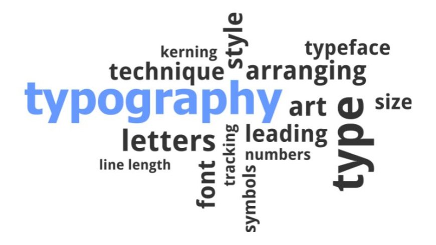
What is Typography?
Typography is the art and technique of arranging type to make written language legible, readable, and visually appealing. It encompasses typefaces, fonts, spacing, alignment, and other design elements contributing to a polished and professional appearance.
Key Elements of Typography
1. Typeface vs. Font
-
Typeface refers to the design of the characters (e.g., Arial, Times New Roman, Helvetica).
-
Font is a specific style, weight, and size within a typeface family (e.g., Arial Bold 12pt).
2. Hierarchy
-
Typography hierarchy helps guide the reader’s eye and emphasizes key points.
-
It is achieved through different font sizes, weights, and styles.
-
Headlines, subheadings, and body text should be clearly distinguished to improve readability.
3. Kerning, Tracking, and Leading
-
Kerning: Adjusting space between individual letters for a balanced look.
-
Tracking: Adjusting the spacing between all characters in a word or paragraph.
-
Leading: The vertical spacing between lines of text to ensure readability.
4. Alignment & Justification
-
Common alignments include Left, Right, Center, and Justified.
-
Left-aligned text is the most readable for long paragraphs.
-
Justified text creates a clean block but can sometimes cause uneven spacing.
5. Contrast & Readability
-
High contrast between text and background improves readability.
-
Avoid using too many typefaces in a single design; stick to 2-3 complementary fonts.
-
Use bold and italics sparingly to highlight important information.
6. Serif vs. Sans Serif Fonts
-
Serif fonts (e.g., Times New Roman, Georgia) have small strokes at the end of letters, making them ideal for print.
-
Sans-serif fonts (e.g., Arial, Helvetica) have a clean and modern look for digital screens.
7. White Space
-
Also known as negative space, it improves the visual balance of text.
-
Helps in creating an elegant, uncluttered design.
Best Practices for Effective Typography
-
Choose typefaces that match the tone of your content.
-
Maintain consistency in font usage throughout a project.
-
Use sufficient line spacing to enhance readability.
-
Avoid excessive decorative fonts in professional settings.
-
Test typography across different screen sizes and resolutions for digital designs.
Conclusion
Typography is a powerful tool that shapes how people perceive and interact with content. Mastering the basics of typography can elevate your designs and ensure clear communication. As a designer, experimenting with different typefaces, spacing, and layouts will help you develop a keen eye for effective typography.
Applying these principles allows you to create visually appealing and highly readable designs that leave a lasting impression.
What's Your Reaction?